MISSION
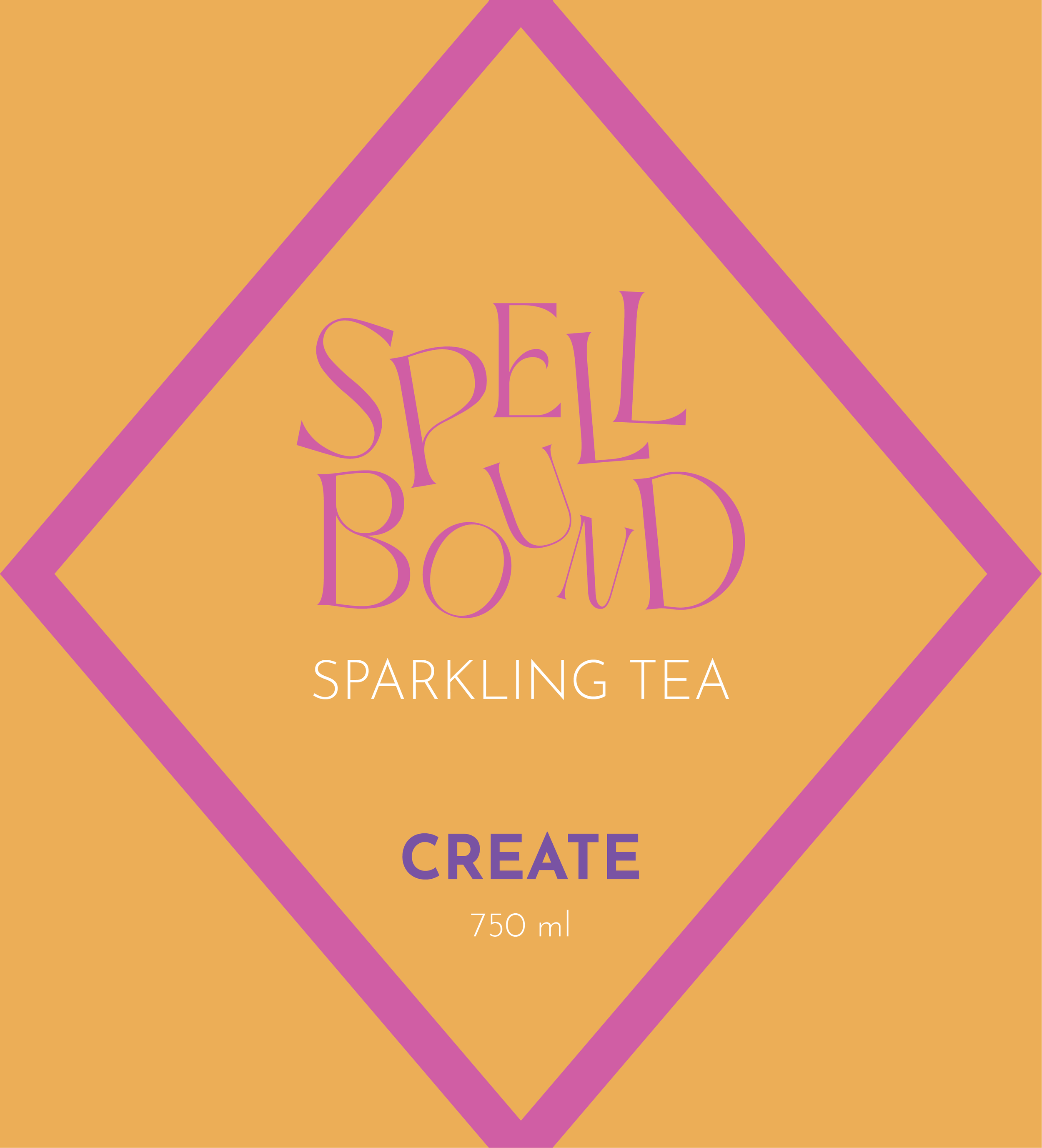
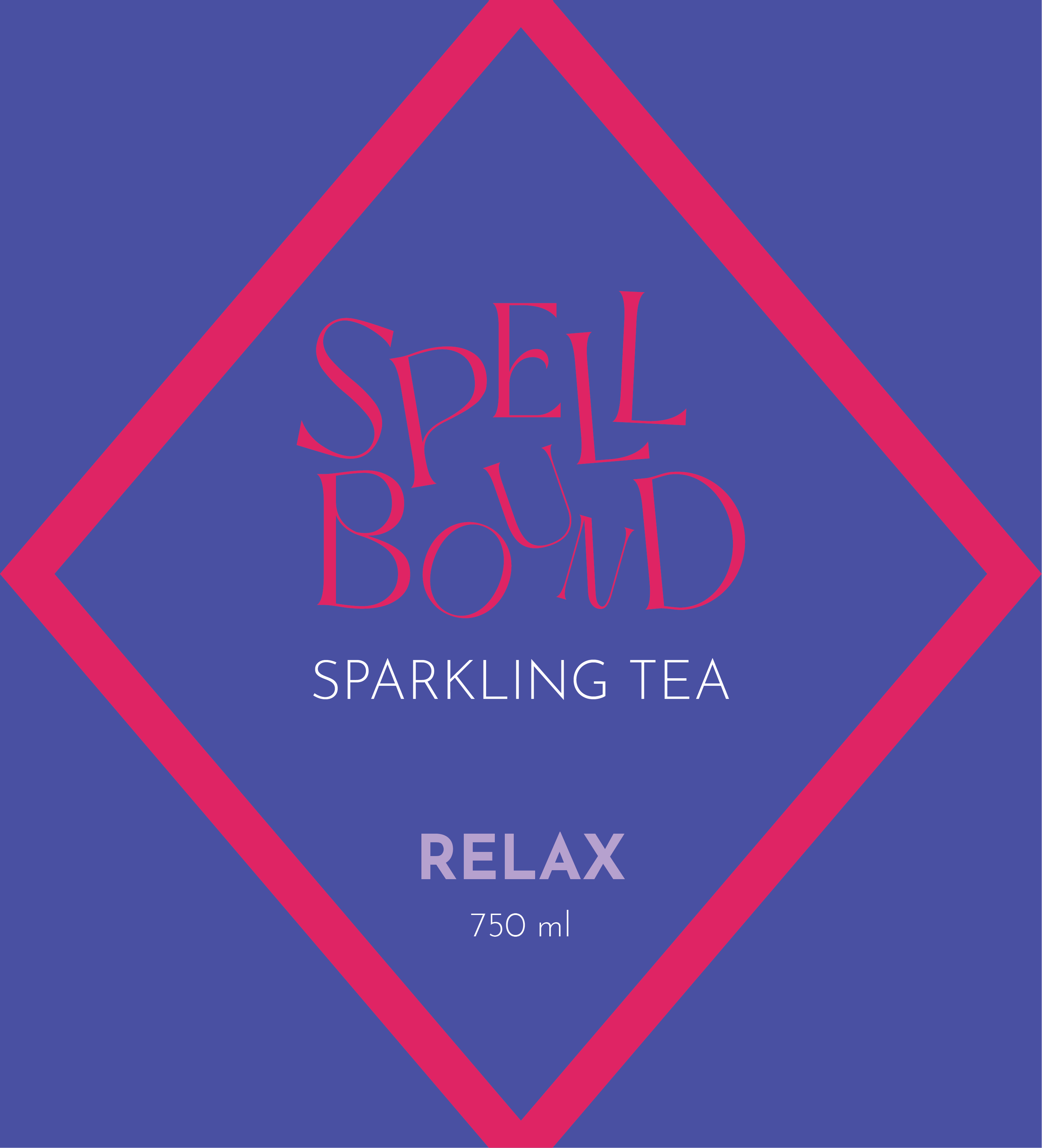
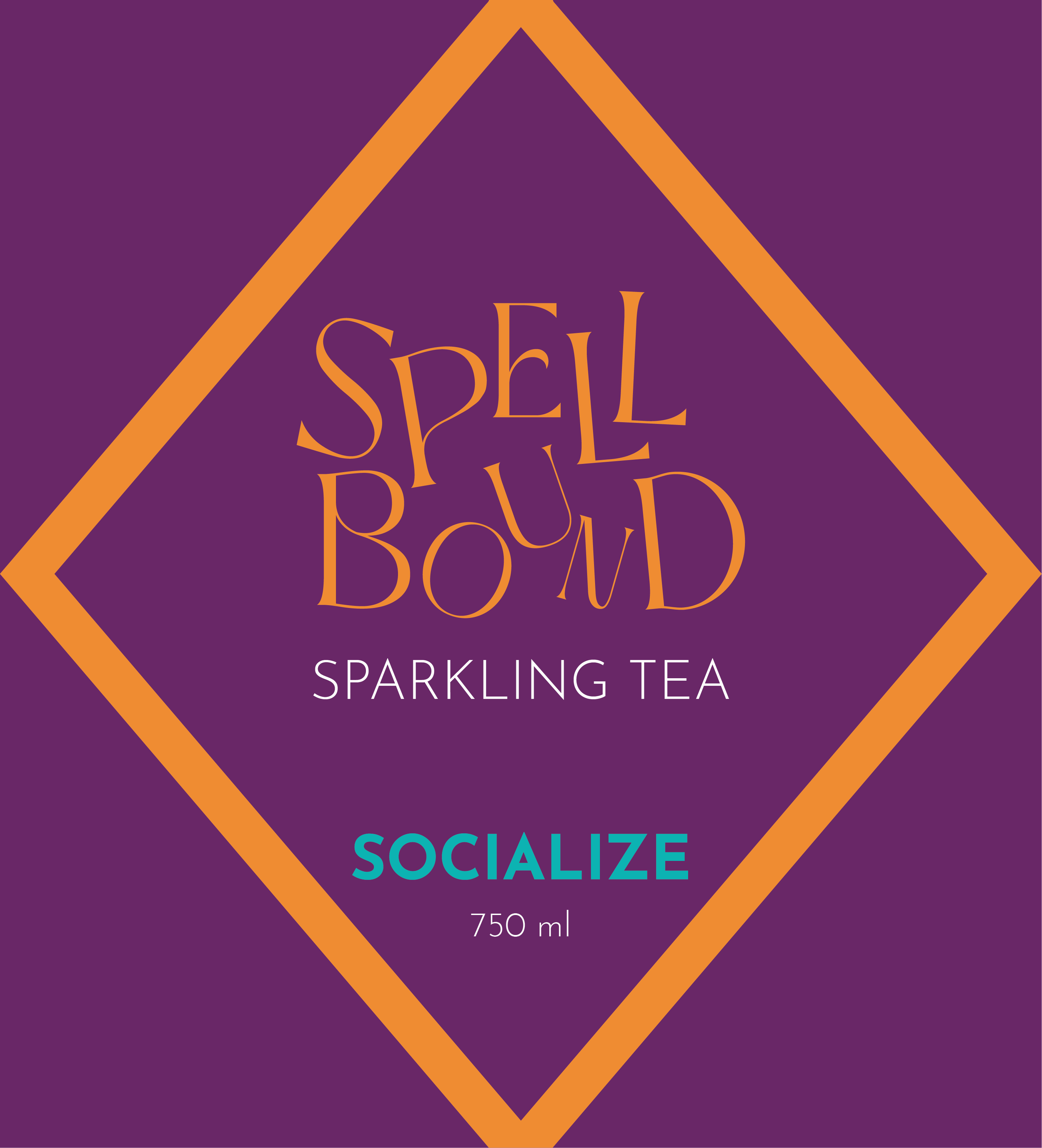
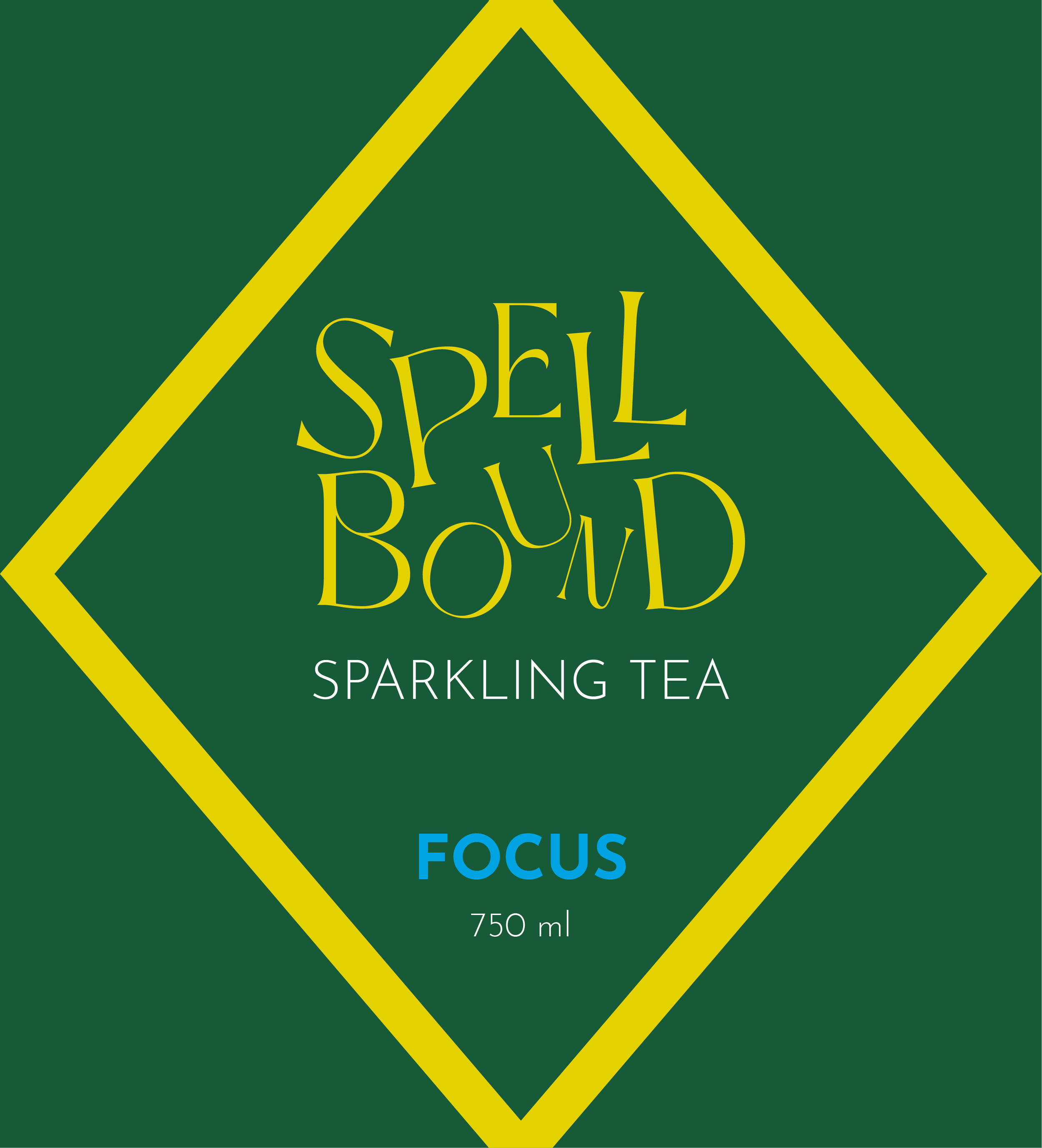
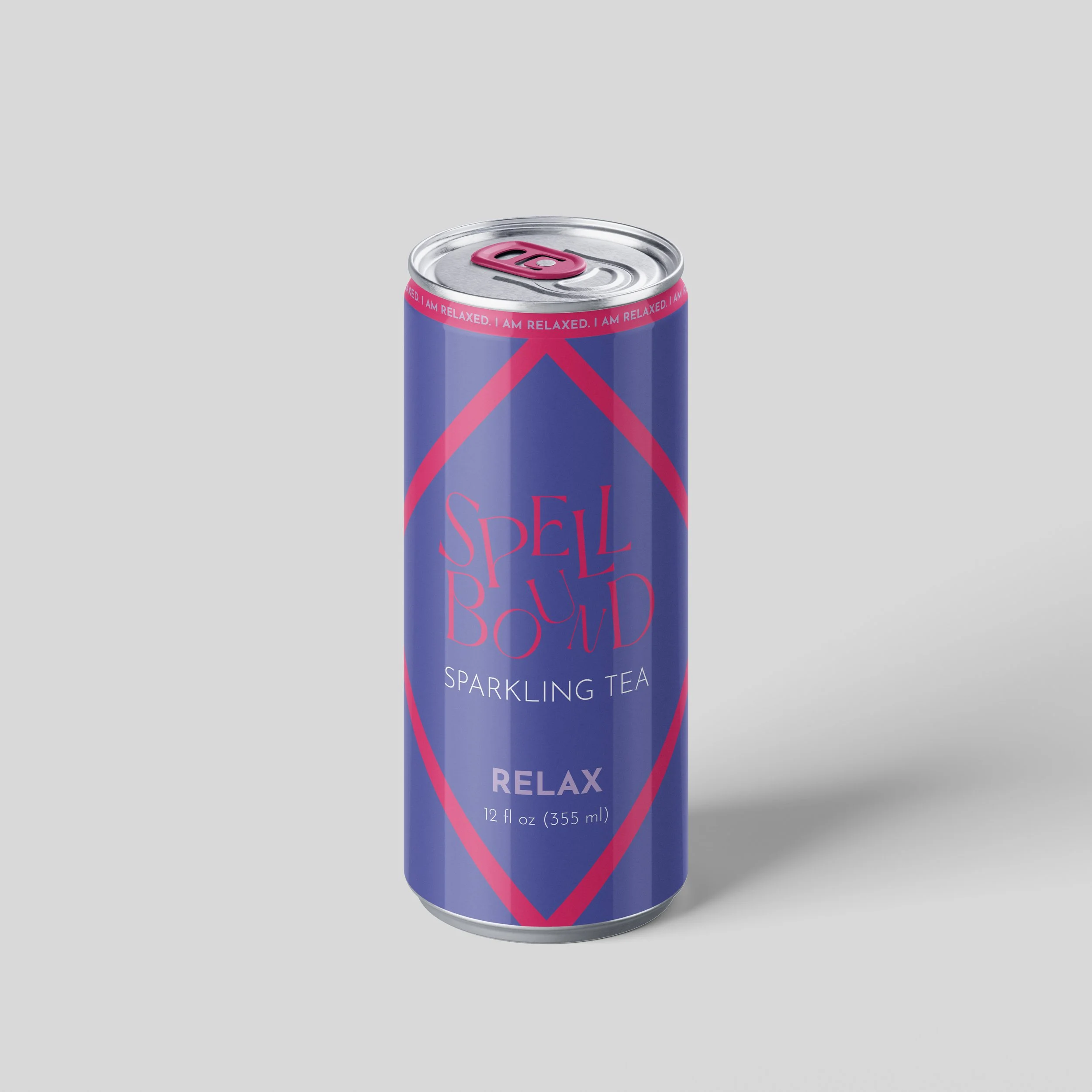
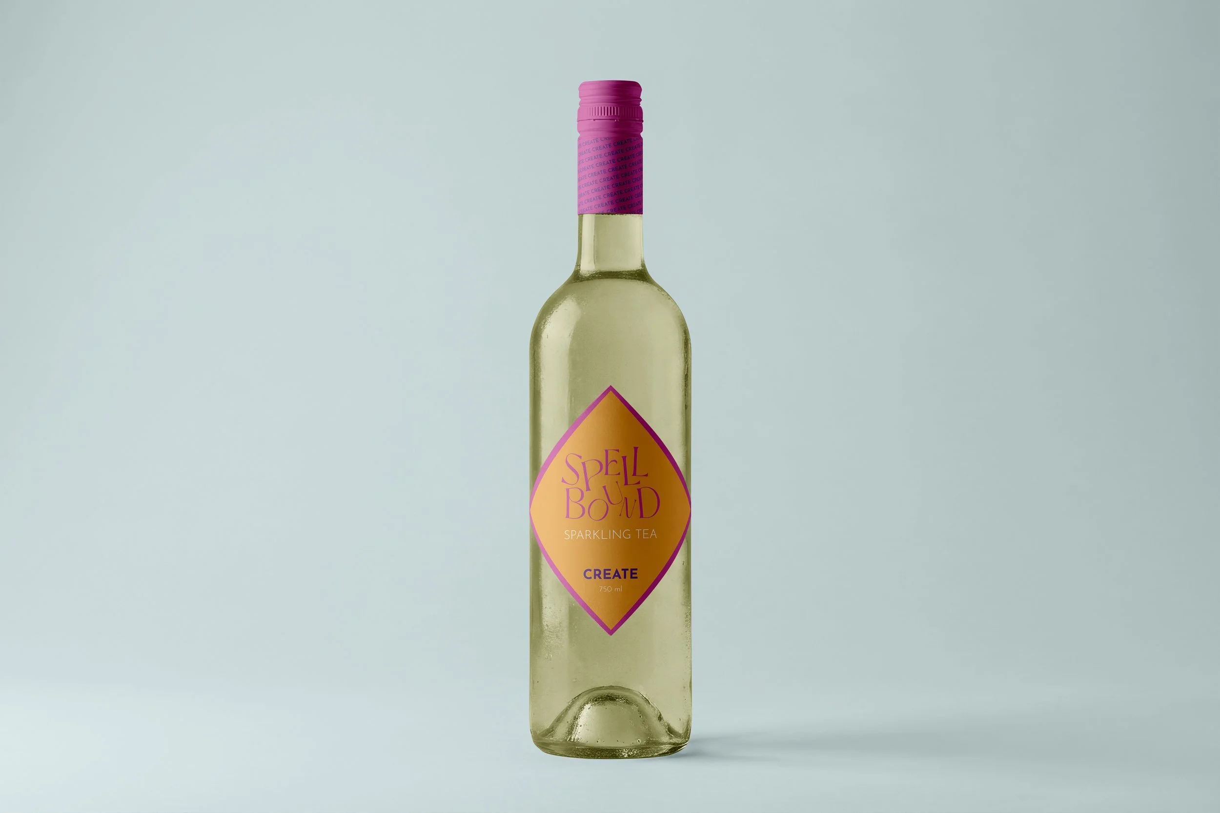
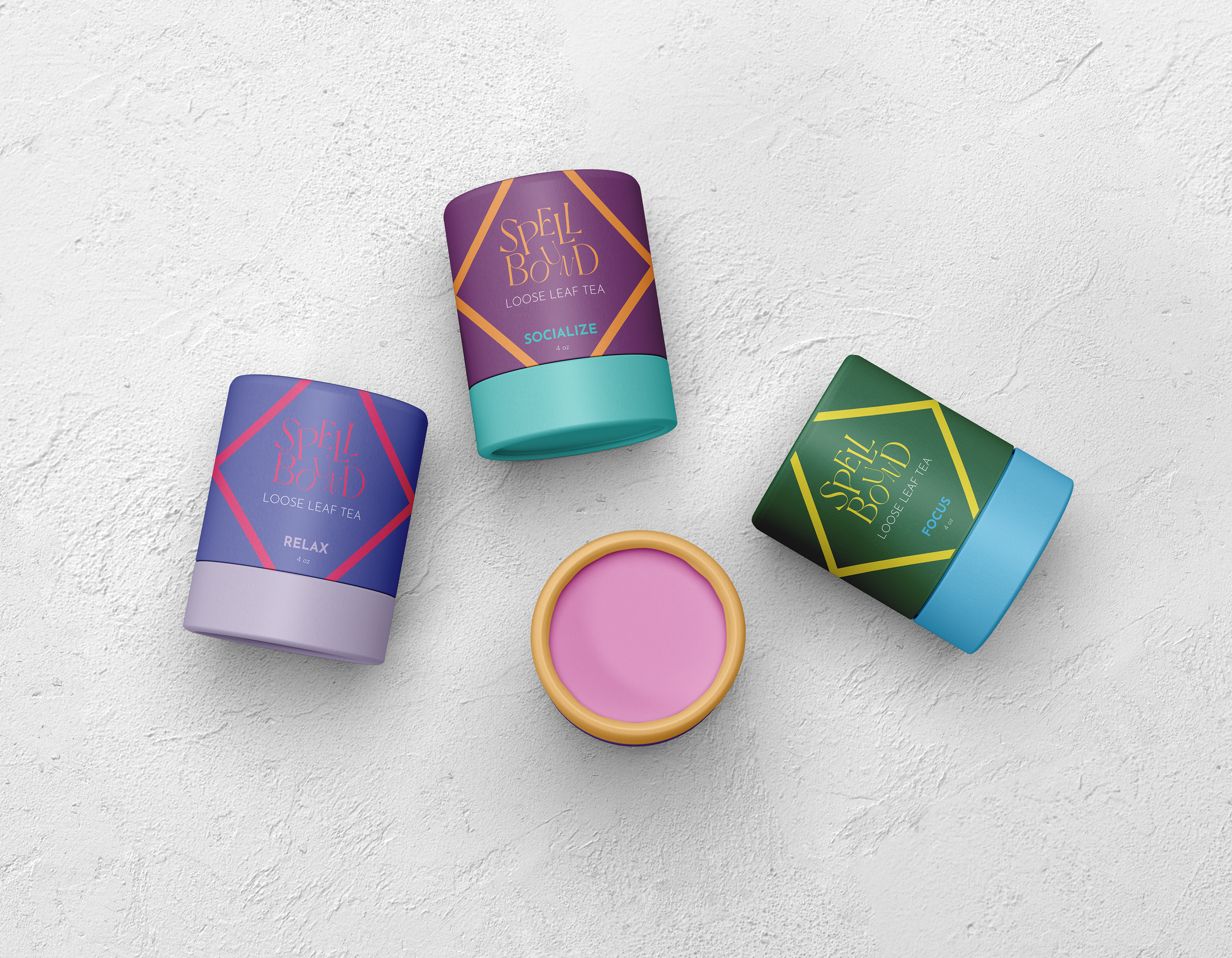
Spellbound is a conceptual wellness brand that focuses on being present and intentional. Spellbound’s mission is to enjoy the life you’re living with a little more mindfulness. The letter logo is intended to feel playful, fluid, and spiritual due to the name, herbal ingredients, and mindfulness focus of brand. The ingredients of the teas align with the intention of the consumer: Create, Relax, Socialize, Focus.
TARGET AUDIENCE
-25-34 year olds
-Spiritual, Mindfulness, and Wellness enthusiasts
PRODUCTS
-Sparkling Tea
-Loose Leaf Tea
BRANDING & CREATIVE DIRECTION
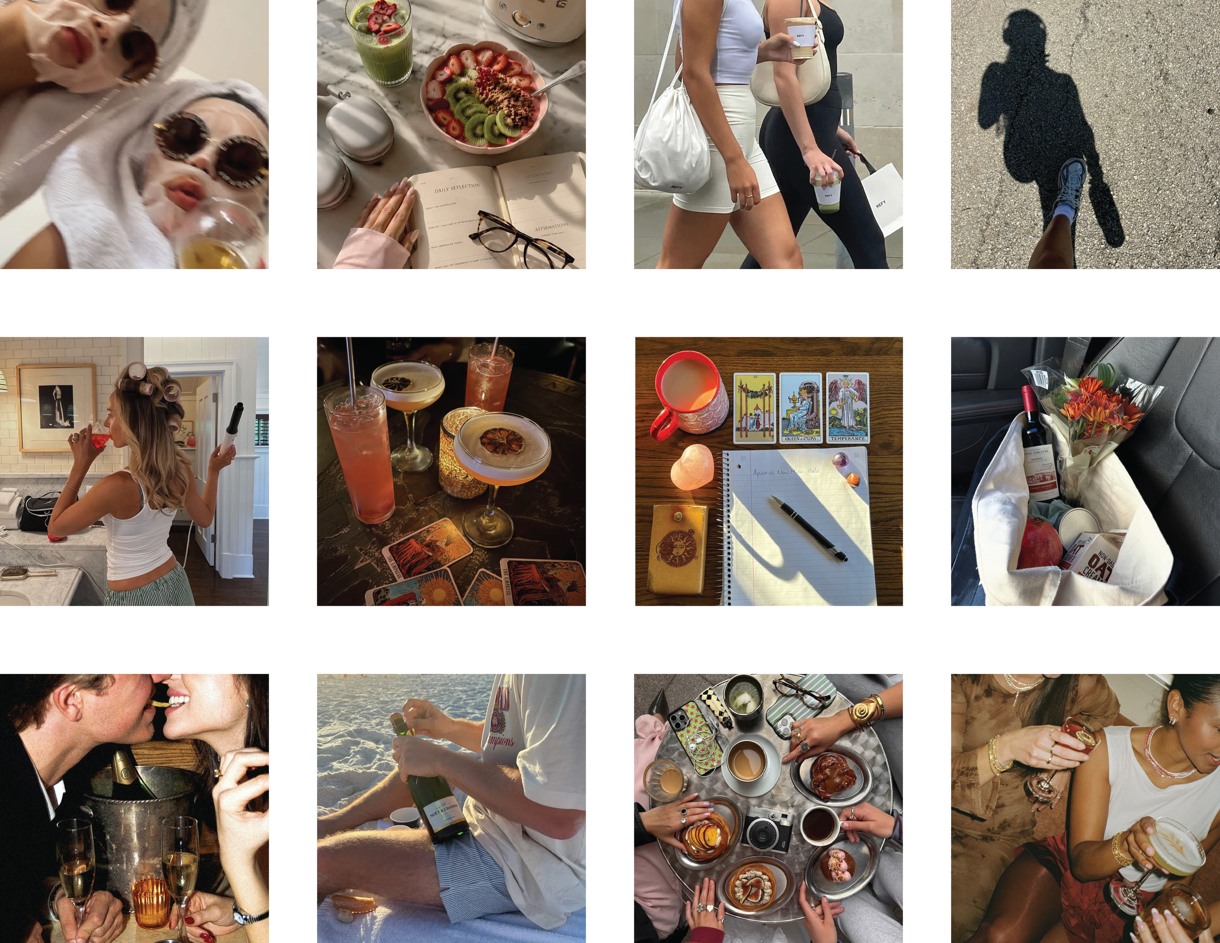
The branding is colorful and vibrant. Products utilize color psychology and the chakra system to connect the mind and body to the intention set.
SOCIAL MEDIA
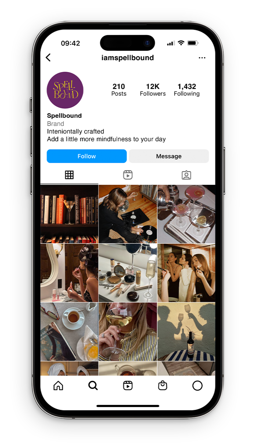
-Lifestyle
-photo & video moments based on tea intention
-Campaigns
-Product shots
-Wellness and mindfulness
-prompts, tips, video
-Brand events & activations
-Collaborations

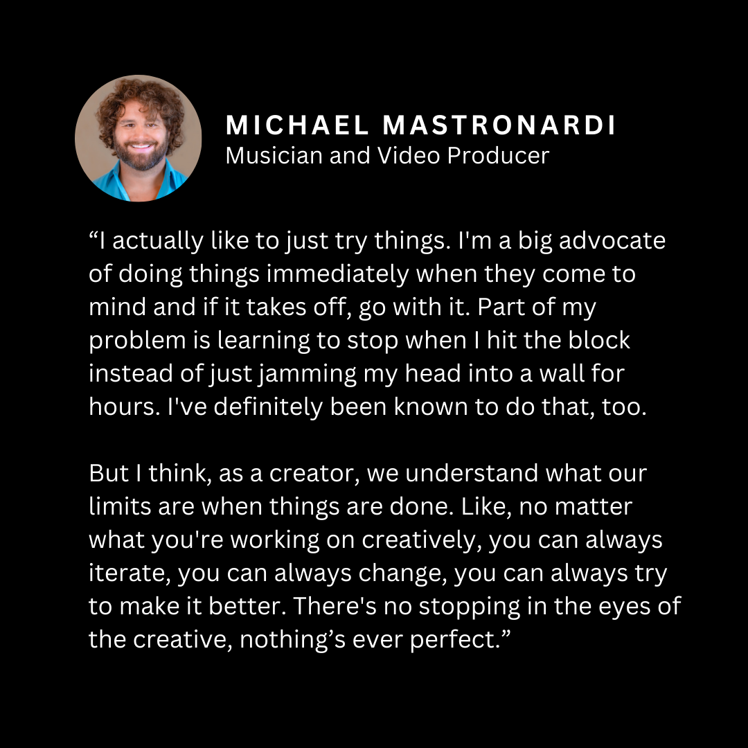
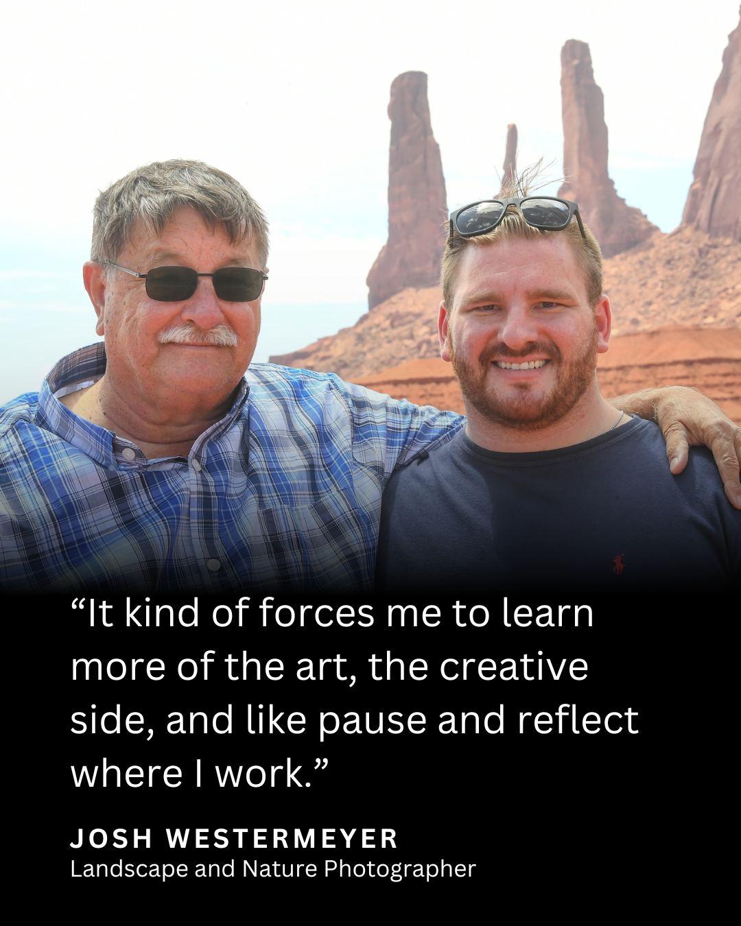
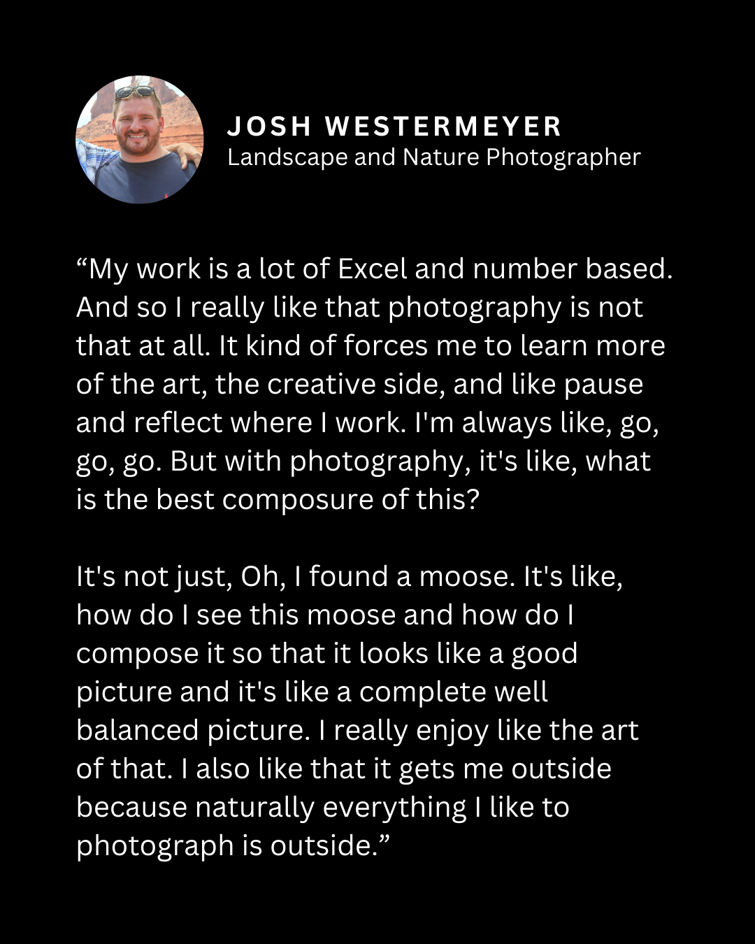
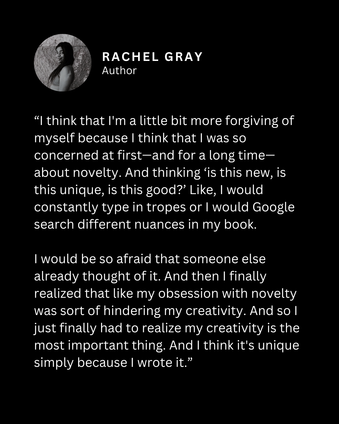
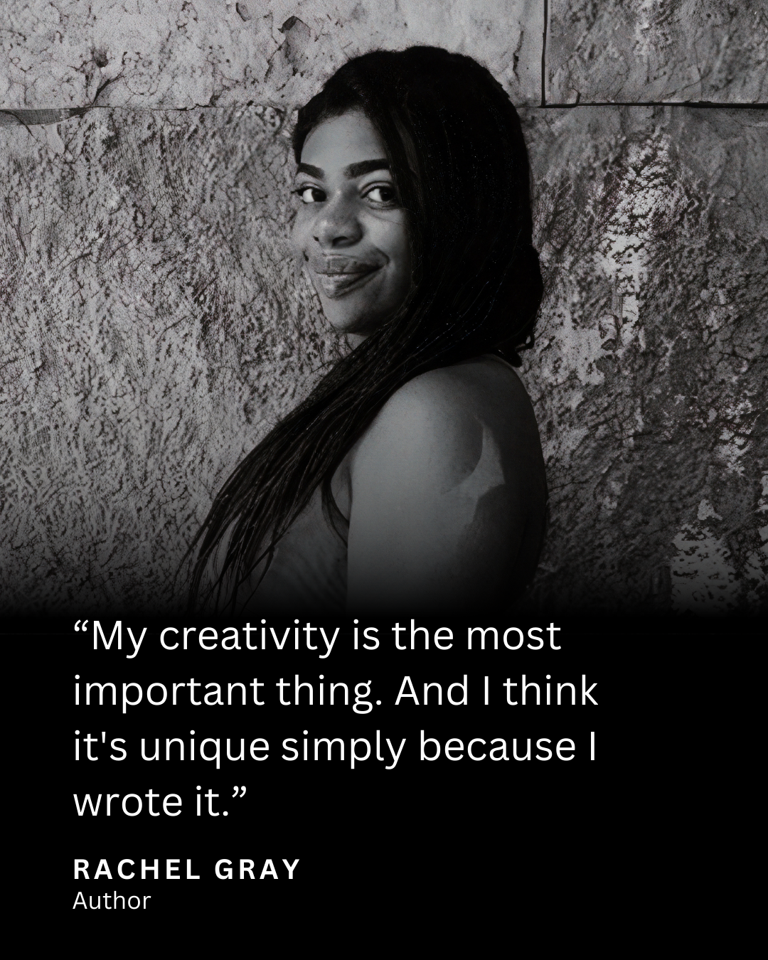
Invisible Talent was a project centered around interviewing artists of various mediums. The name alludes to anyone being an artist, because you don’t always know someone is an artist just by looking at them. The goal of the project was to connect with other creatives, have new conversations, and showcase art like an online museum. It started as a readable newsletter that evolved into video format.
The project featured creatives from a wide range of fields, including photography, video, music, animation, and writing. The podcast like format gave an inside look behind their creative process and allowed them to talk in more depth about individual pieces. Each episode was treated like a gallery exhibit that showcased 6-10 pieces of work.
The project was promoted on social media with episode snippets and branded templates.

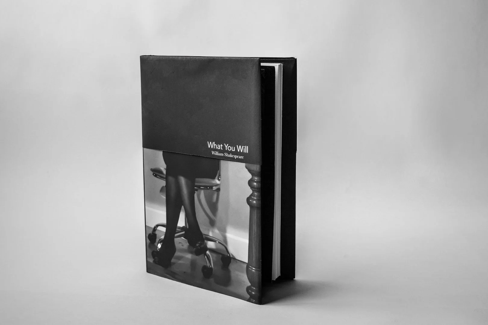
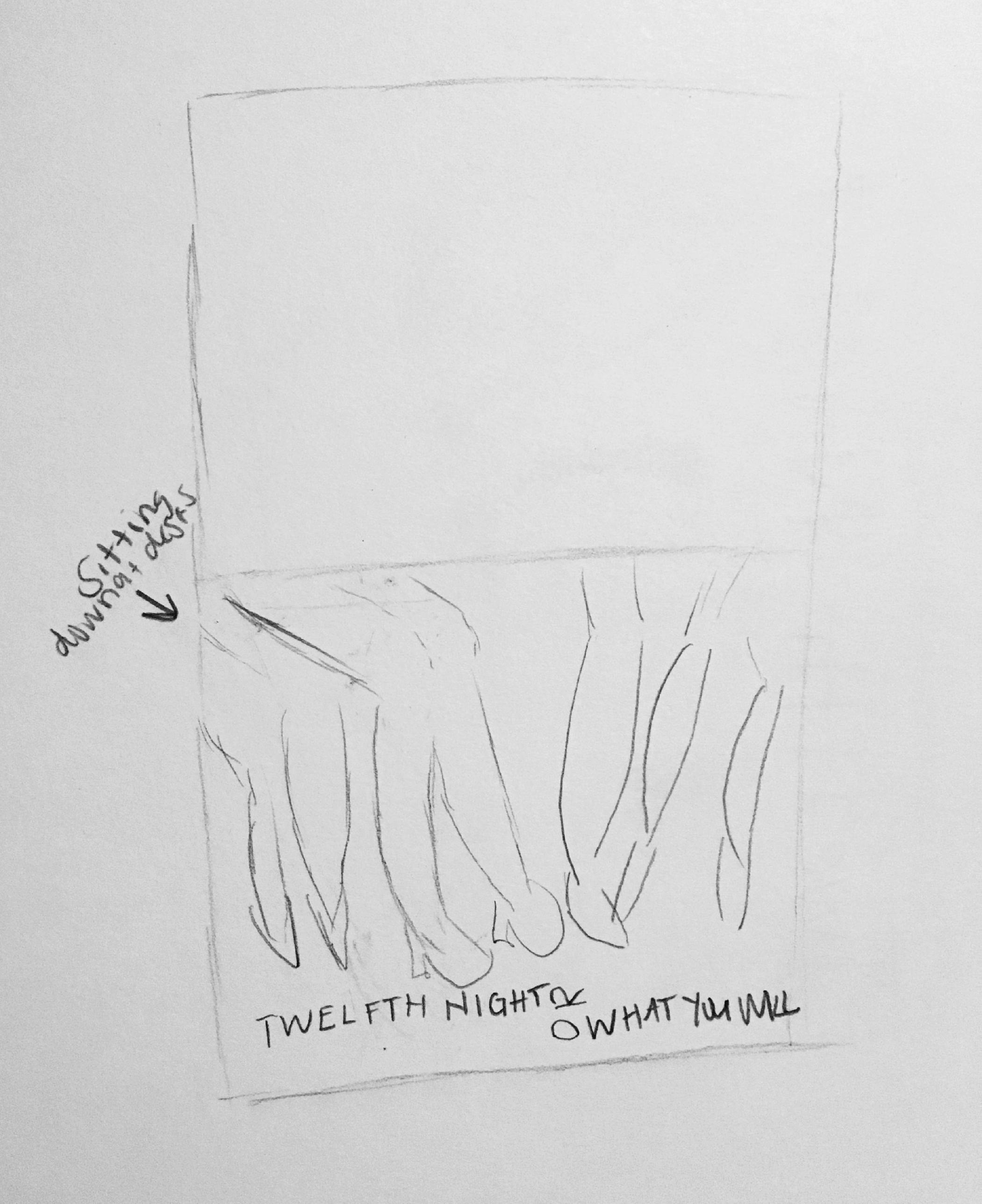
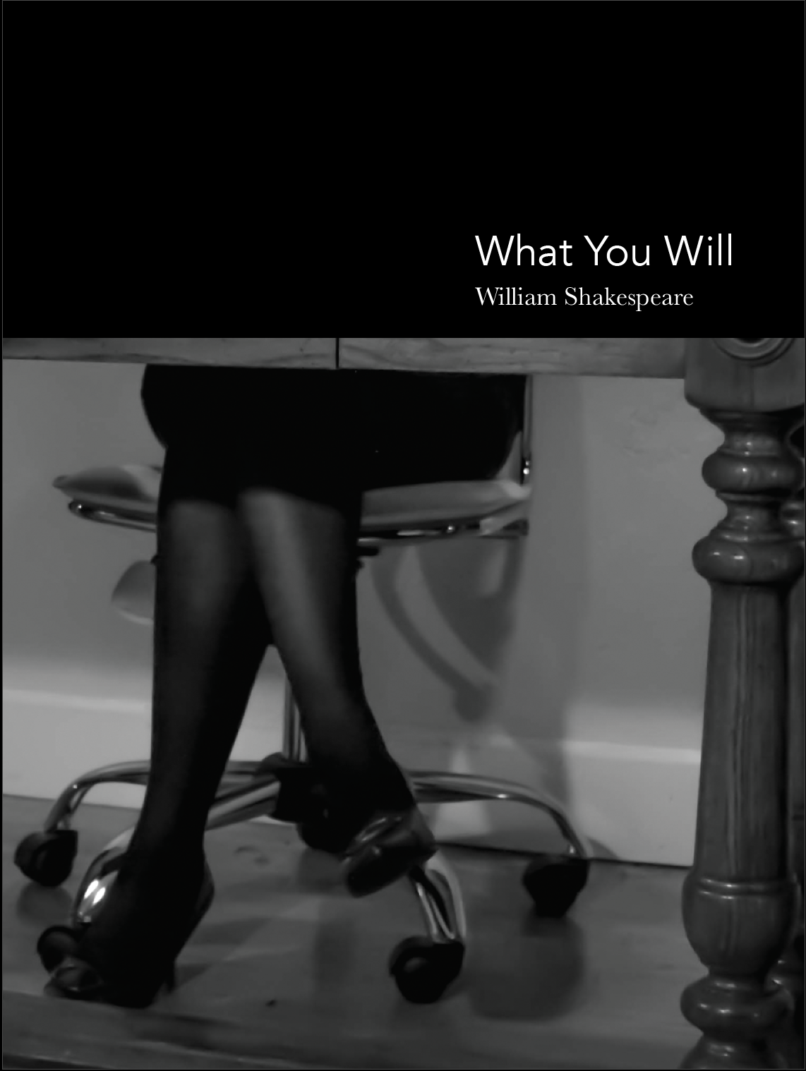
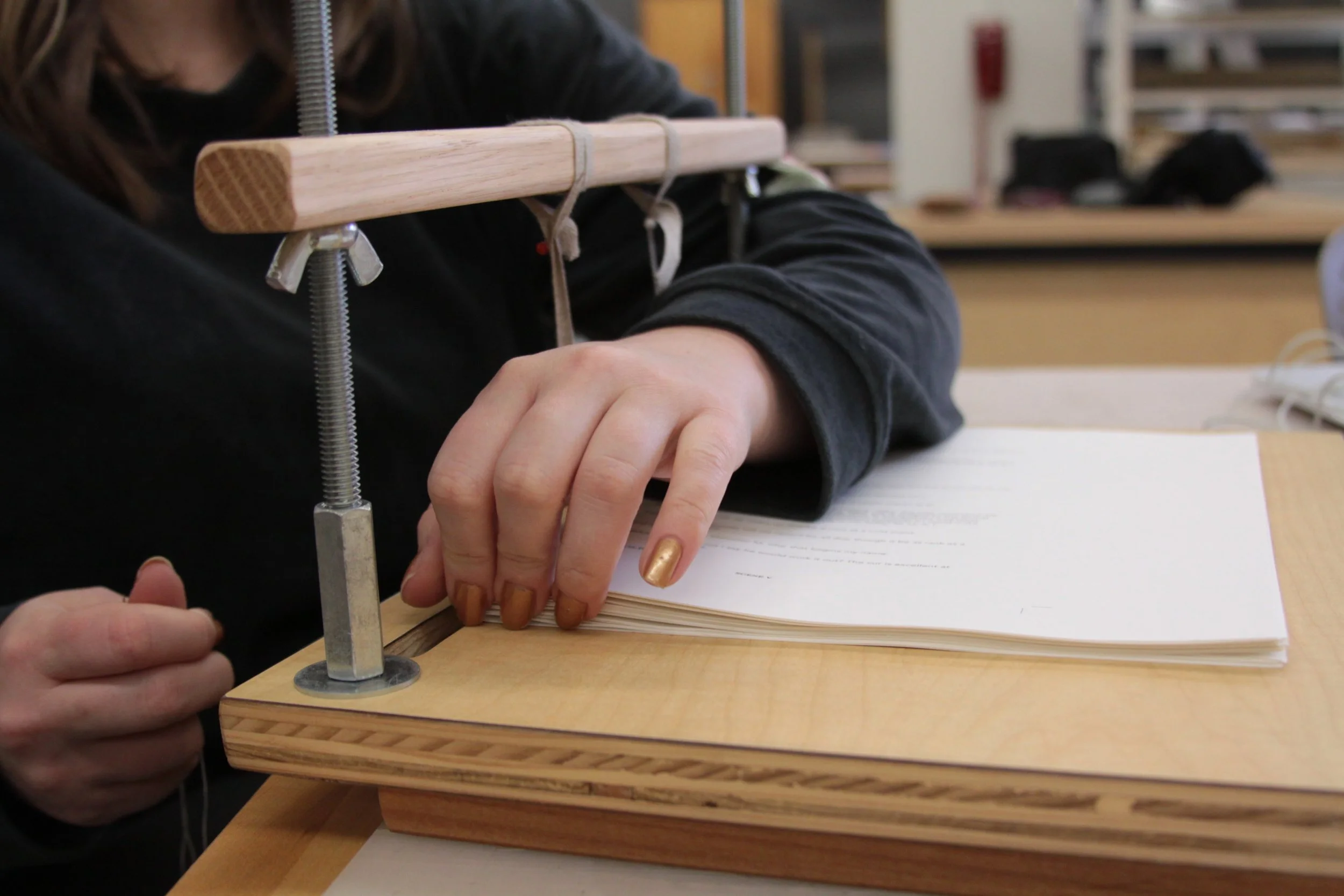
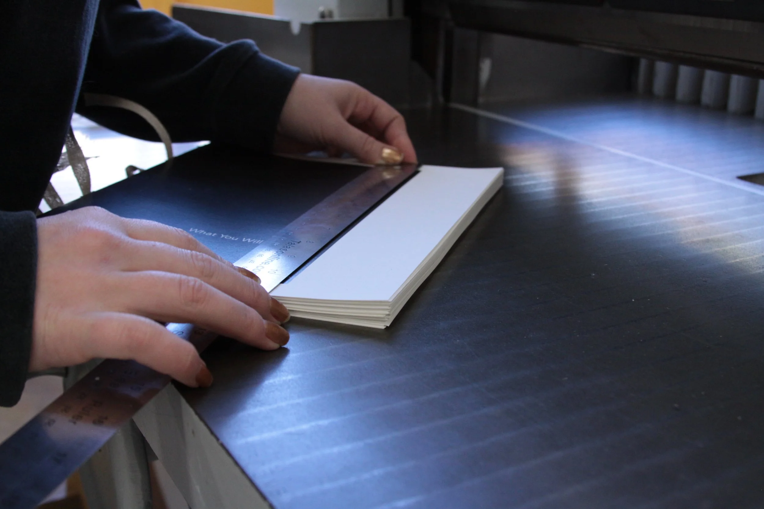
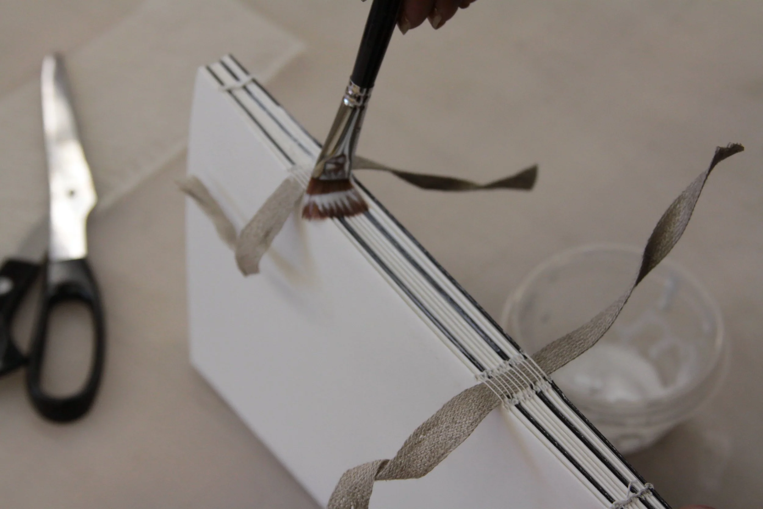
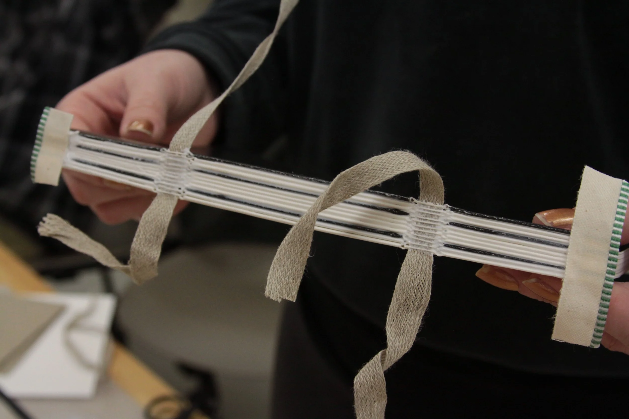
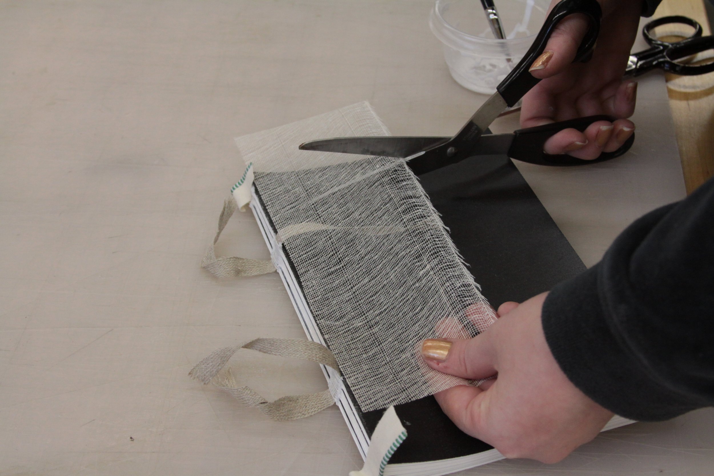
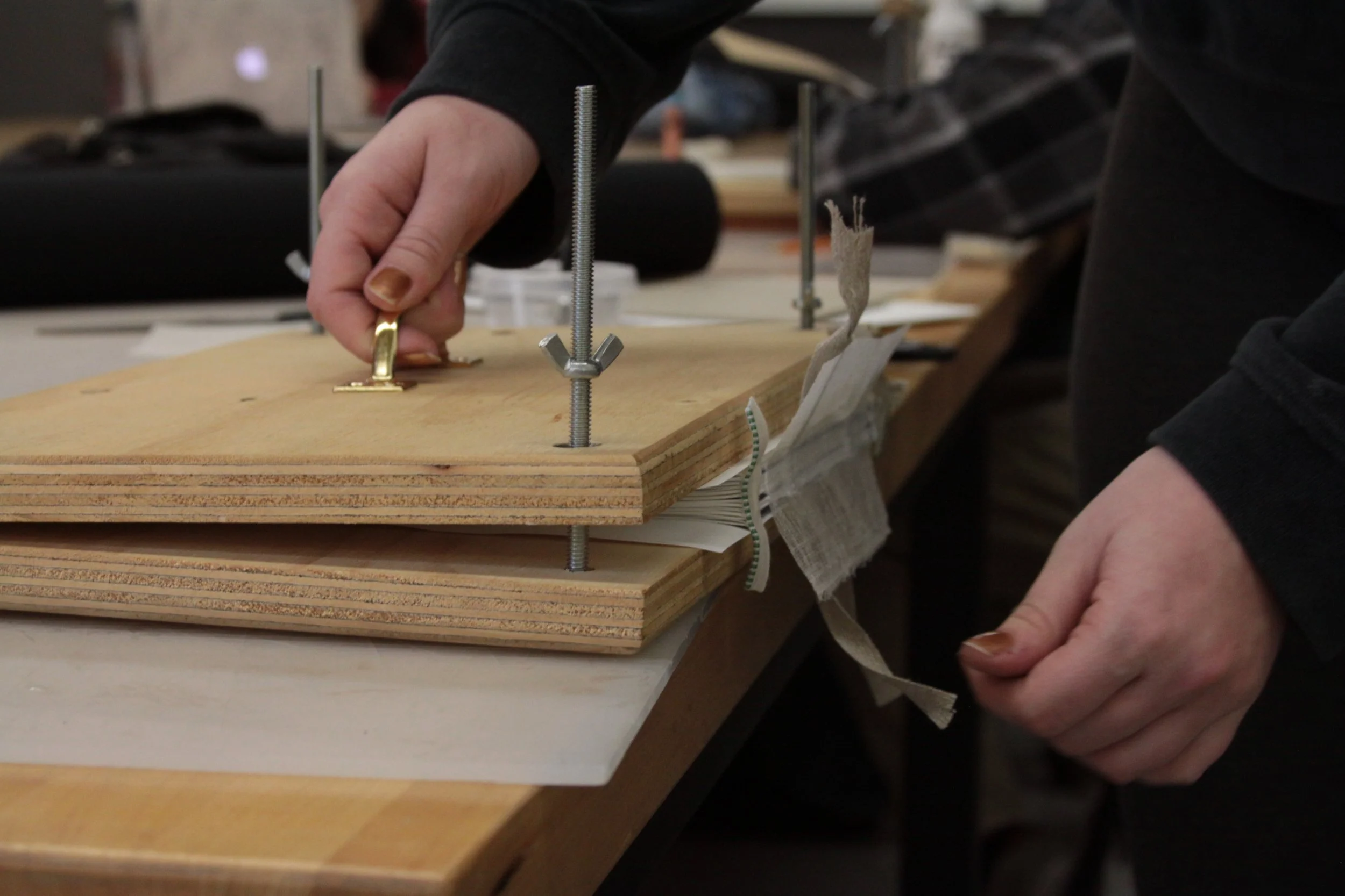
Twelfth Night, or What You, Will by William Shakespeare is a hand-bound book designed for a publication design course. While the story centers on gender swapping, love triangles, and miscommunication, the design of the book focuses on the stereotypes of gender roles. The beginning of each chapter highlights how women have gone above and beyond the traditional roles placed upon them.
The concept “don’t judge a book by its cover” and story theme “nothing is what it seems” are portrayed through the physical design of the book. The dust cover uses misdirection by portraying what seems to be a secretary sitting at a desk. Upon further inspection, the dust cover flips up to reveal the woman is actually the founder and CEO of her company.

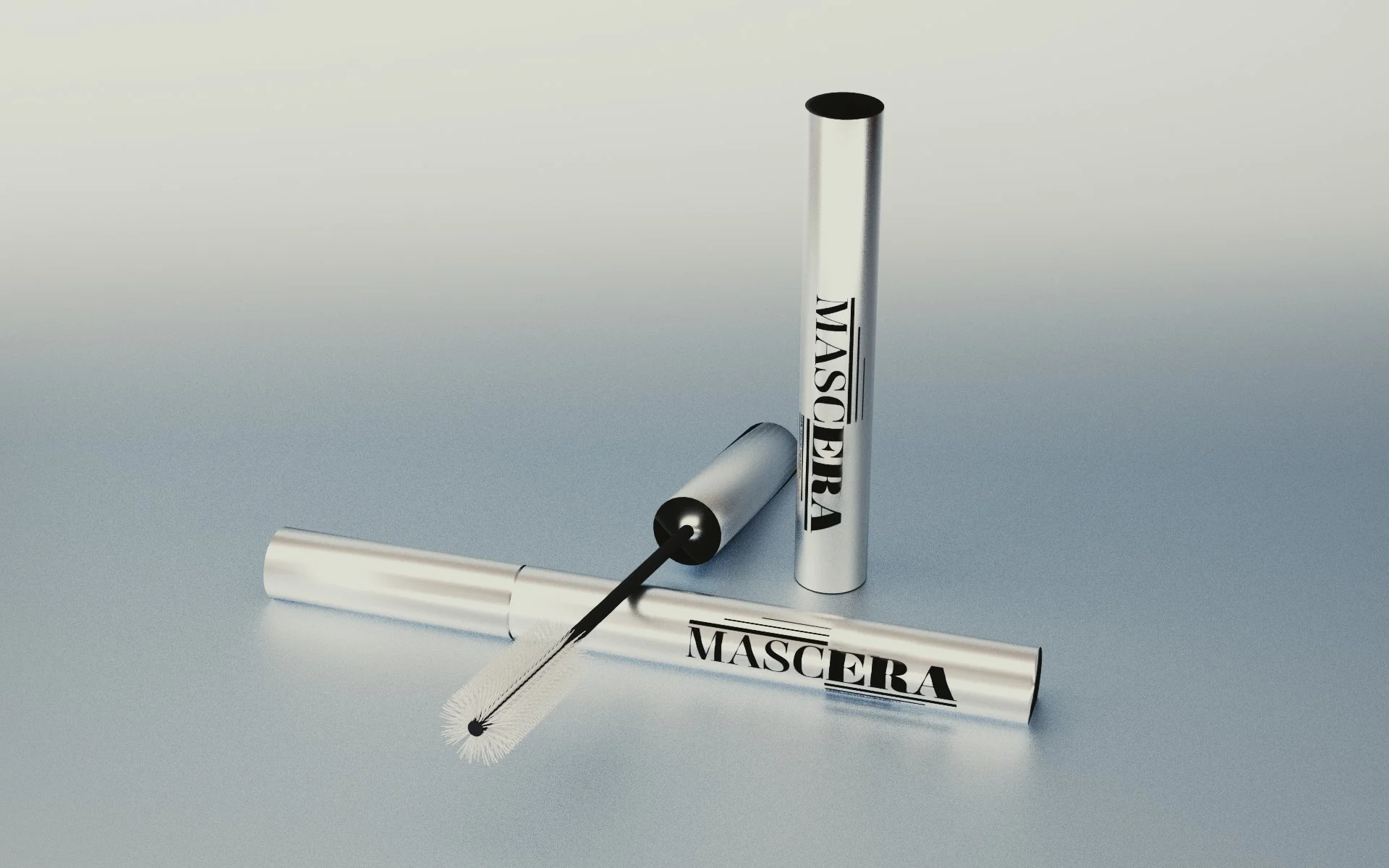
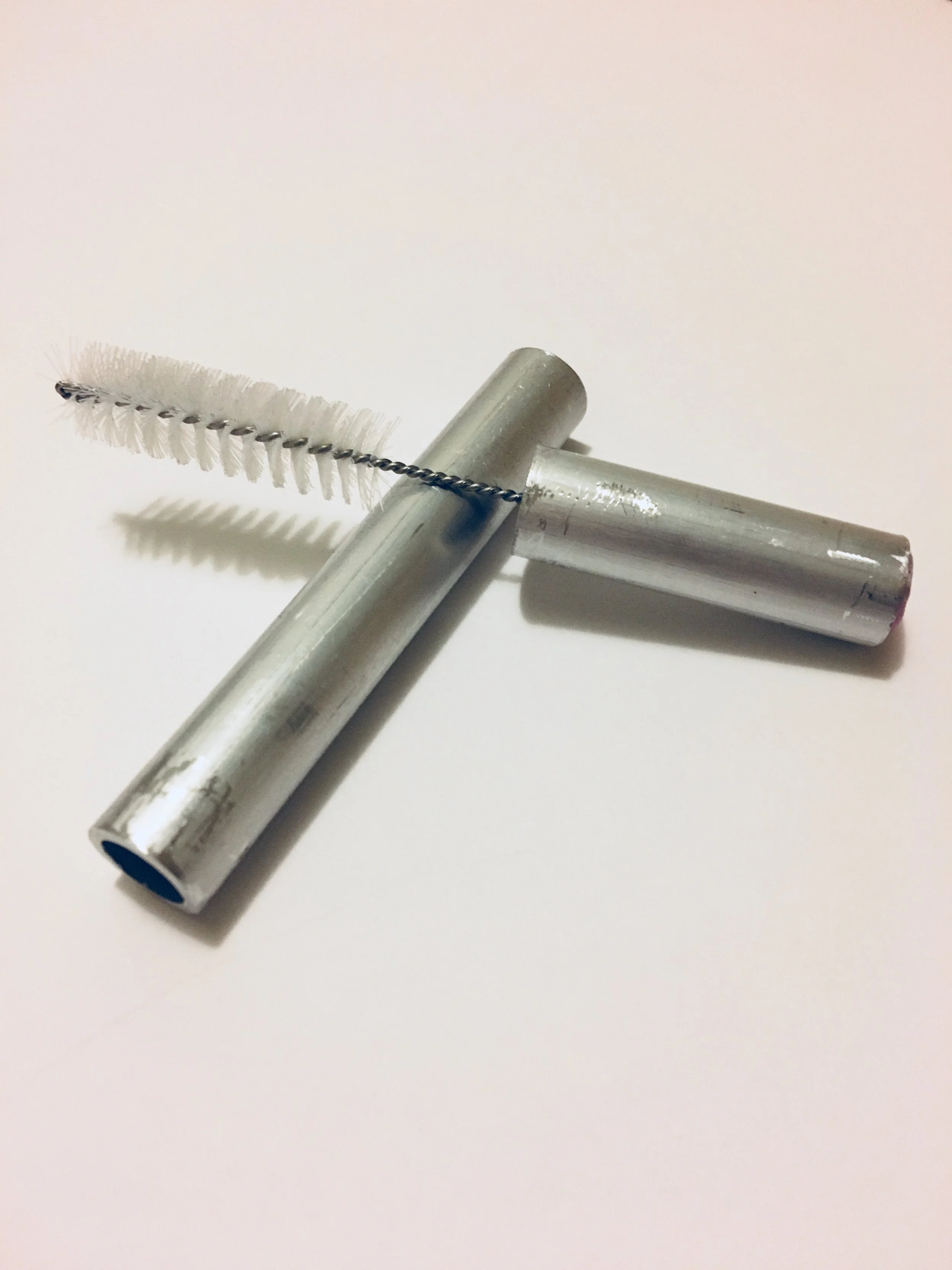
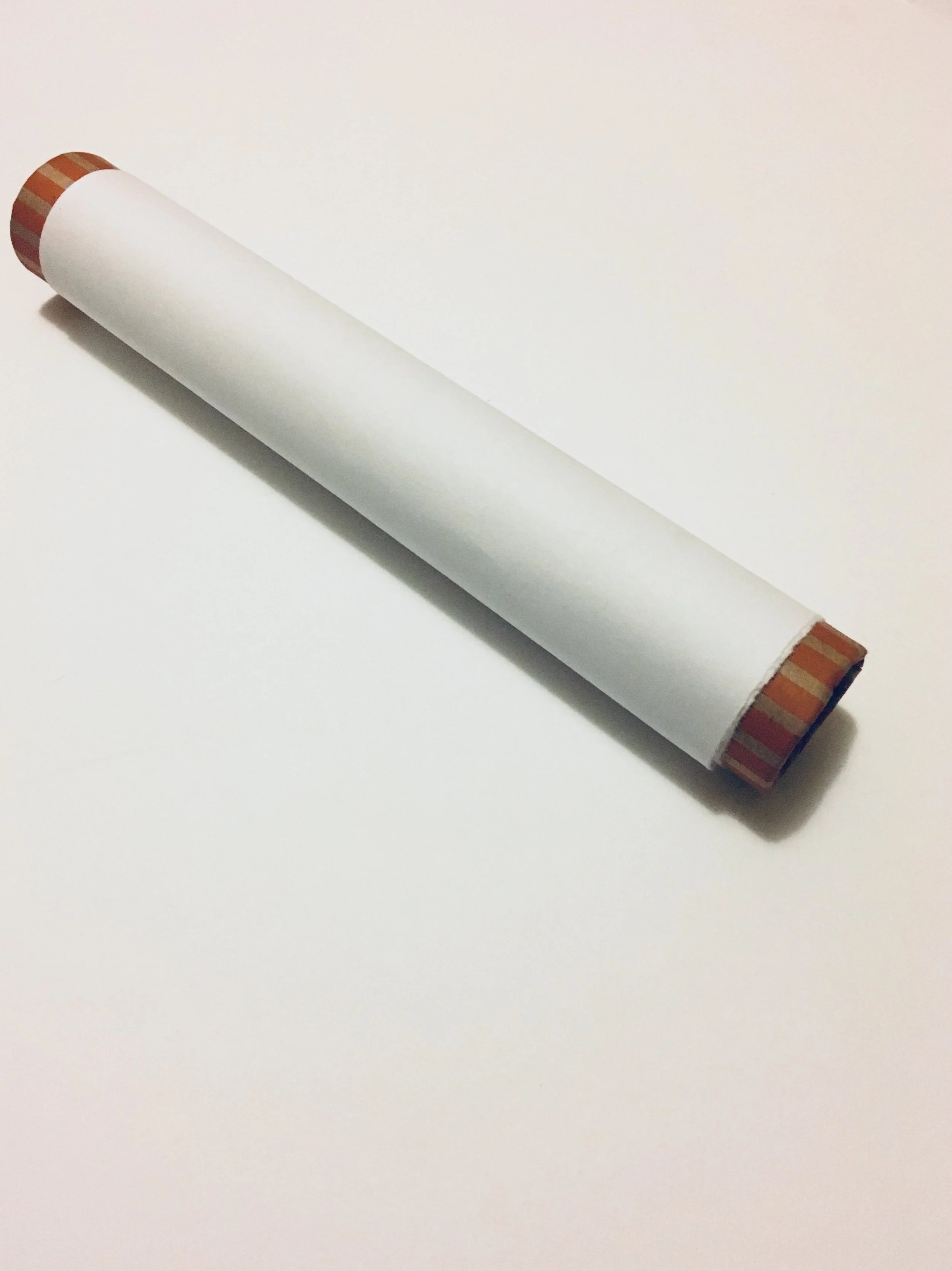
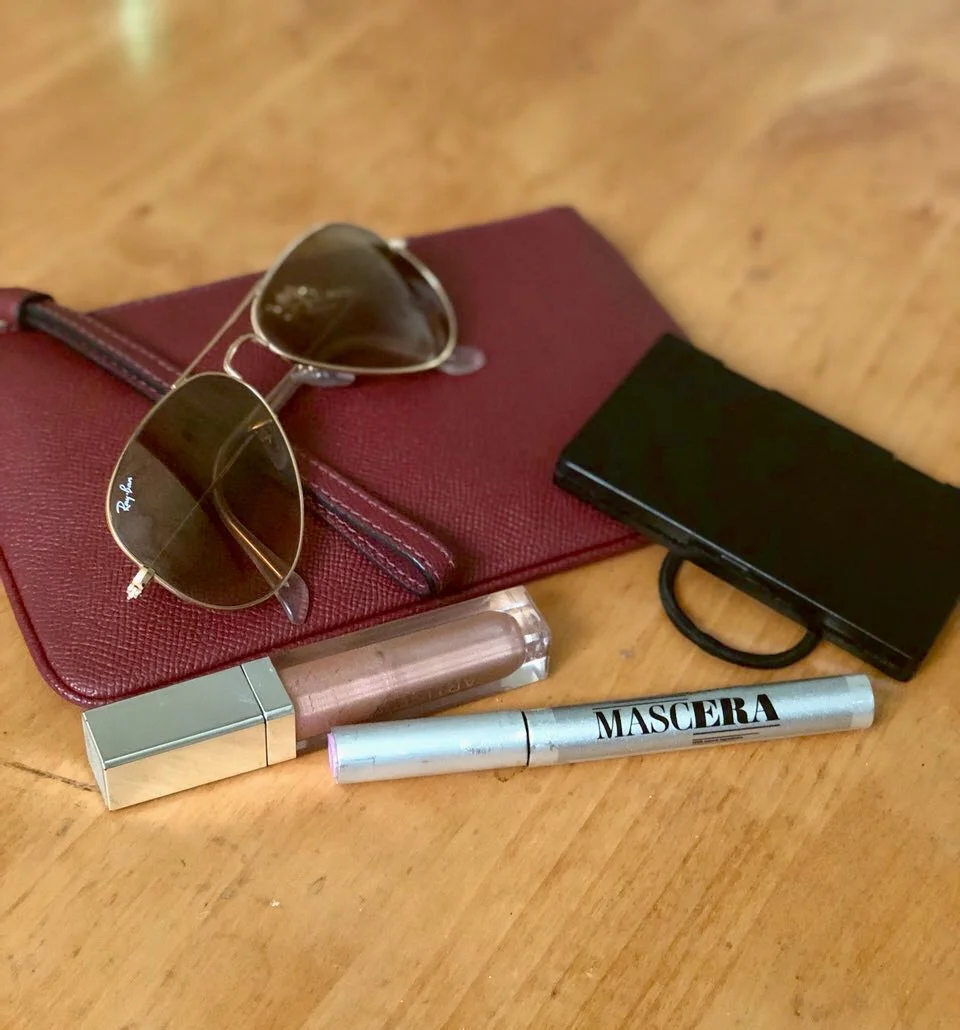
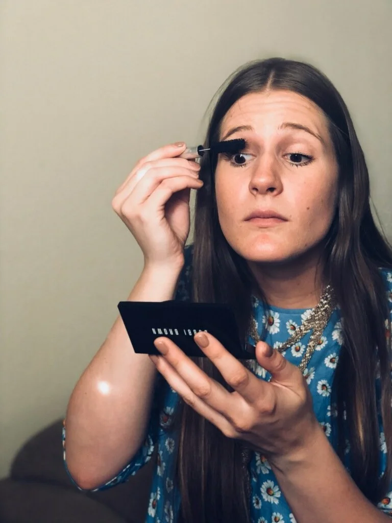
Era Cosmetics and MascEra are a conceptual beauty brand and mascara created for a project focused on sustainable packaging. The goal was to design product packaging that uses little to no plastic. After researching mascara, its ingredients, and packaging, a prototype of the mascara product tube and retail packaging were developed.
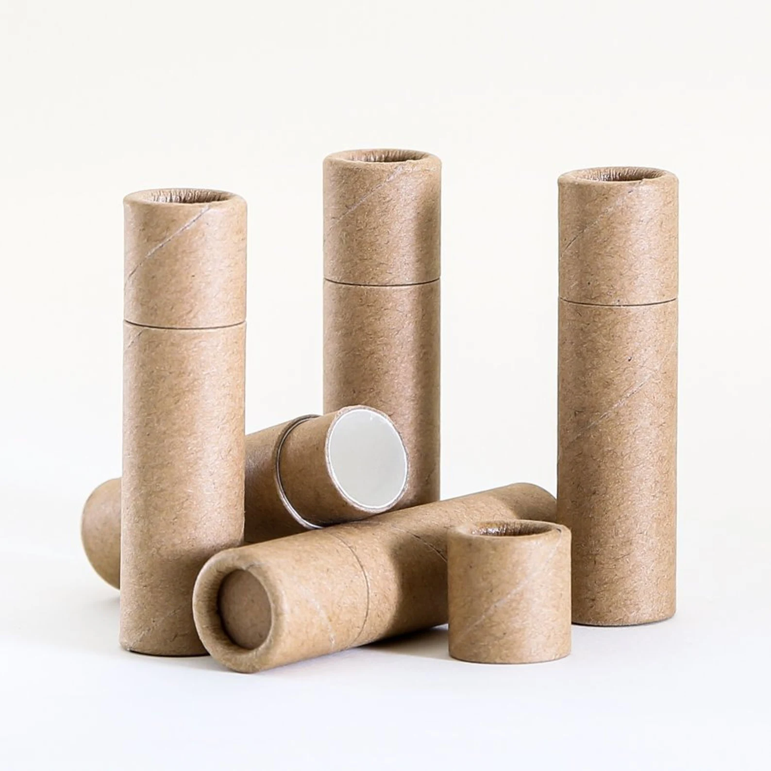
The retail packaging is a recycled cardboard tube with a lid and the product information will be printed onto the cardboard using water based ink that is non-toxic and biodegradable.
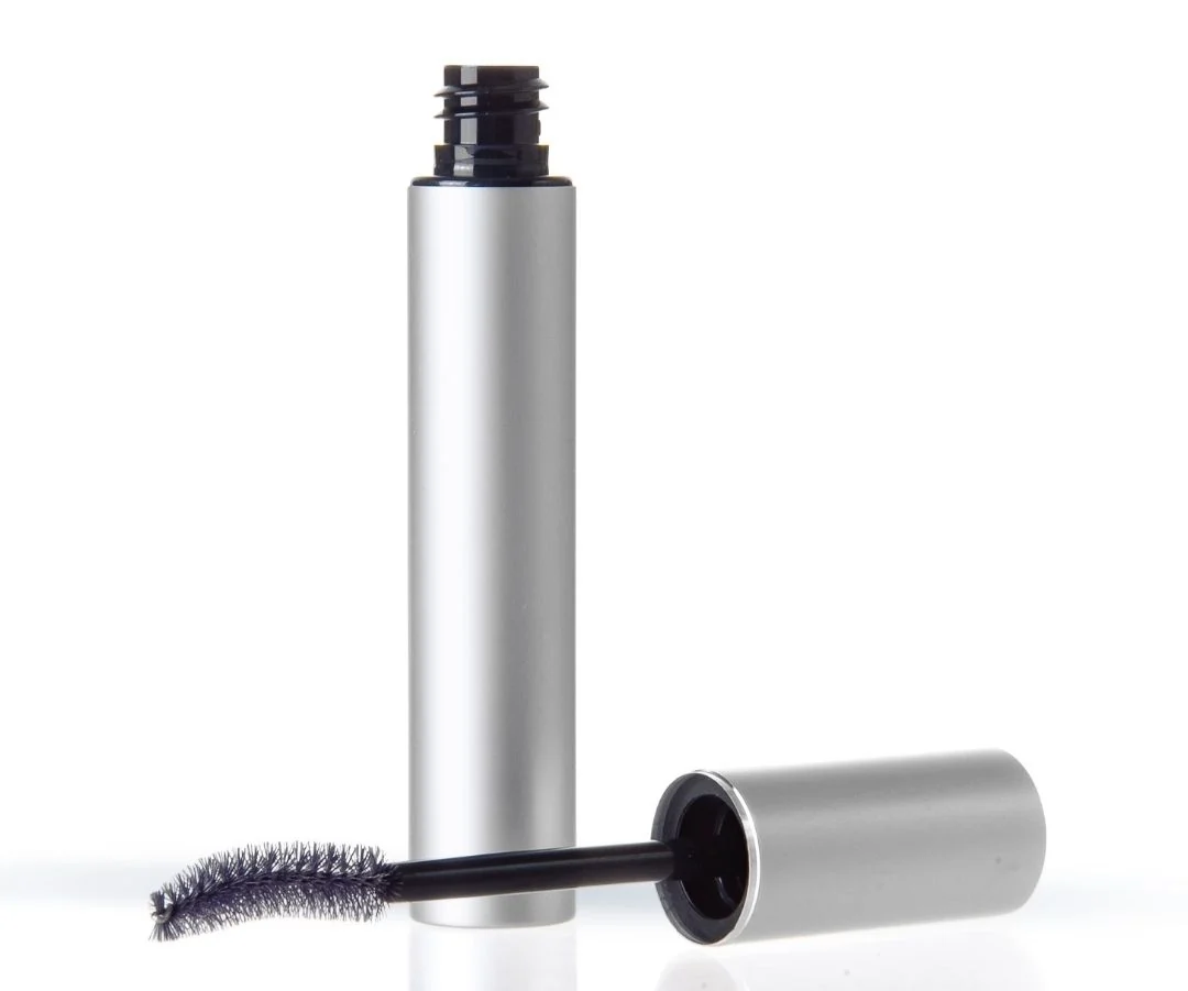
The tube is reusable and made of aluminum. It acts as a case that the mascara product will be inserted into. Also reusable, the wand is made of natural coconut fibers and can be cleaned and dried for reuse.
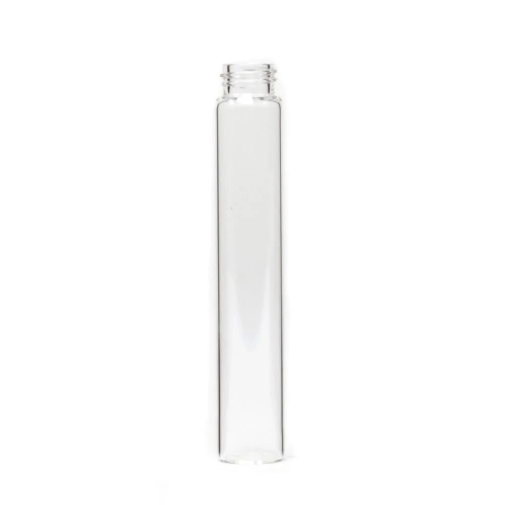
The mascara product will come in a recycled plastic tube that inserts into the aluminum case and is the only part of the mascara that will need to be disposed of and replaced.
PROTOTYPE